The Ultimate Showdown: Ranking the Cleveland Uniforms
There was already a lot of hype and anticipation for the 2025 Cleveland Guardians season, with them fresh off an ALCS appearance. However, that excitement grew even more when the organization revealed some uniform redesigns for next year.
Let’s start with this: Overall, these slight redesigns look fantastic. The piping on all of the uniforms looks great, and it’s a nice callback to some of the classic jerseys from the team’s history.
However, some of these new jerseys stand out above the others. Let’s break down which are the best.

1. Guardians Red Home Uniforms
Taking the top spot as the best of the redesigned uniforms is the new red home alternate jersey.
We’ve seen this “Guardians” font on other promotional items and merchandise, but it’s the first time we’ve seen it on an official uniform. It looks great in these photos and will look even better on a sunny summer Progressive Field afternoon.
Now, just imagine this jersey with a “World Series” patch on it and another one on the hat.
2. Cleveland’s Navy Away Jersey
Just behind the red home uniforms are the all-new navy blue away jerseys.
They’re new, they’re fresh, it’s different, and these navy blue uniforms are going to make staying up late during their first road trip of the 2025 season worth it.
Fans have been asking Cleveland to do something unique with the away uniforms since they rebranded with a new name following the 2021 season.
This jersey delivers on that ask with the large “diamond C” over the heart and red and white piping on the sleeves. It’s a simple look, but it definitely works and is completely different from what the team has had in the past.
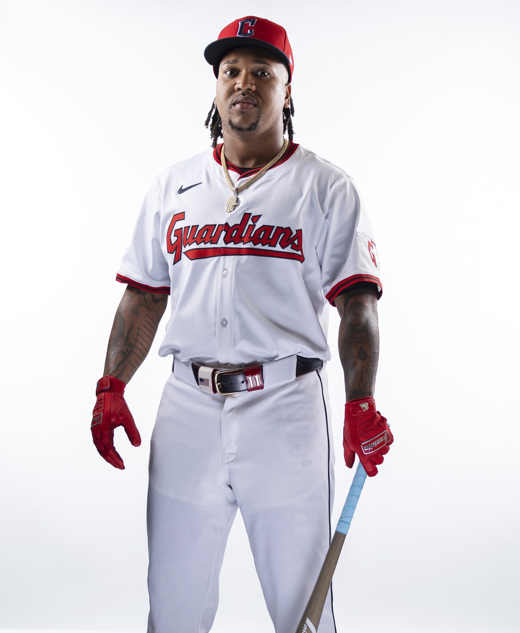
3. Guardians White Home Uniform
The only big difference with the actual jersey is the red and navy lining, which looks great. However, the hat is now primarily red with a navy “C” and navy bill. This is a straight reversal of their red alternate jersey hat.
At first glance, the red hat does stick out, as perhaps it is a little distracting when adding it to the white jersey.
However, the red hats could work with some other red accessories such as batting gloves, sleeves, undershirts, Andres Gimenez’s red mitt, and maybe some red cleats as well.
4. Cleveland’s Grey Away Jersey
There’s nothing necessarily wrong with these uniforms. The other uniforms are just on another tier compared to them.
The Guardians didn’t do much with this redesign other than add the striping, which looks great. Ultimately, these come in last on this ranking, but their simplicity makes it hard to find something to dislike about them.
